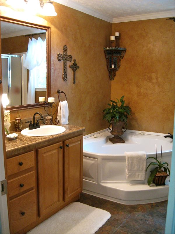
Let’s get this out of the way: I am a person who loves color! I tend to surround myself with it because it makes me happy. However, white has been everywhere for a while, and I couldn’t help but imagine what this bath would look like with fluffy, white towels and accessories. So, using things I already had, I tried it. Take a look…


I don’t normally have any faux foliage, but I had this faux orchid and thought since it is white, it would work here.

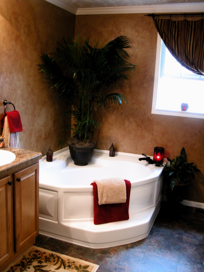
I had a large palm tree in the corner here which I loved, but it does not do well there in the winter. I decided to try something different, so I brought this Moroccan shelf in from the dining room and this peace lily. My real orchid on the step is just about to bloom, and I cannot tell you how excited I am to have kept it alive for over a year!

I really thought the white would give it a more “spa-like” feel.

But, I must say, I prefer it this way!

You can see the original bath HERE and decide which you like best. Sometimes a little change is all we need to reaffirm that we were on the right track to begin with:-)
BTW…this is a budget bath! Peel and stick tiles, laminate counter with ceramic tile edging, sink faucet was a $59 overstock.com special, mirror trim is reclaimed from my great grandmother’s guest house, and I did the texture on the walls myself.
I’ll be joining Kim at “Savvy Southern Style” for Wow Us Wednesdays so be sure to stop by there!!
Thanks for stopping by!! After working on a baby shower this weekend, I’m now hard at work trying to make something nice out of my girls’ room. It is a disaster in the worst way, so I’m hoping a week is enough time!


I would have never guessed that was peel and stick tiles. I also tried a "spa look" in my bathroom once and it didn't last long. I thought it just looked like I had stolen towels from the Holiday Inn. I do like that faux orchid though.
I like it Anita…just right really.
Hi Anita, I love the look of your bathroom. I think the palm makes it look luxurious. The texture on the walls is really nice. xo,
Hi Anita, So very pretty and fresh. I love the green plant in the spa tub, and the pretty lamp with crystals is a perfect size!The soap pump is elegant and all the fluffy towels. Your crosses are gorgeous and the whole effect is timeless and Old World….Love it all!
Looks fantastic, so elegant!
Hugs
Charo
Now you have two gorgeous options! I'm amazed that you redid your bathroom on your own…impressive! Cherry Kay
I think it looks lovely BOTH ways. I do agree that the white is spa like.
I like both plants, of course, but I really love the one in the urn in the white one. (I think it might be the urn.)
And I just realized that I missed a wonderful PINK table while I've been sick. Just wanted you to know that I love it, too.
I like the white touches as it lightens it up. I realize there is a lot of white on blogs now but I also need some colour. Your bathroom looks lovely. Pamela
I'm with you Anita! I was just thinking this yesterday about how much I love color but everyone seems to be doing so much white/neutral. I'm trying to figure out how to lighten and brighten without losing touch with what makes me happy…color! I love your bathroom both ways and don't think you could go wrong with either! 🙂
Vanessa
I think you have brightened up your bathroom a lot with all of your magic touches! The orchid probably loves the humidity. I LOVE your tub, I could definitely relax in there!! Well done, Anita!
XO,
Jane
Don't get me wrong, I love the white and I am also on a light and bright kick, but oh those cozy burgundies just are so warm and inviting!!!
You really can't go wrong either way!
Personally I love the white far better! To me, the burgundy is too dark and not quite the "island feel". In winter a nice taupe or green could do the cozy trick.
Love the iron crucifixes and your overall look as a whole. Found you on houzz.